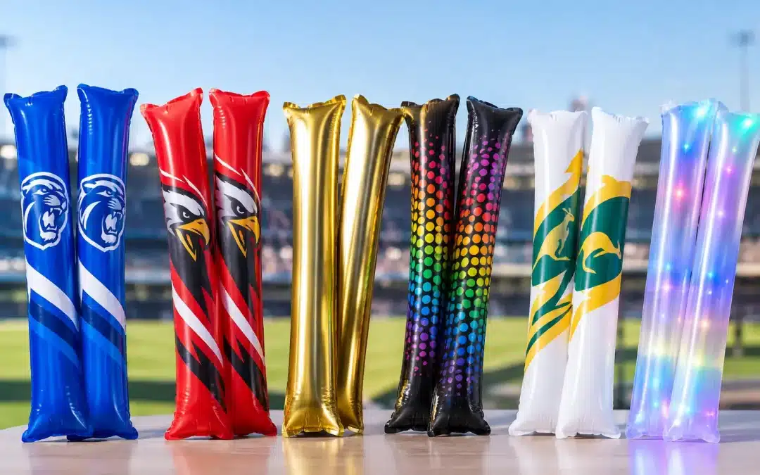
A packed grandstand can turn a simple printed cheering stick into a moving wall of colour. But the same logo can look completely different under stadium lights, in a school hall or across an outdoor festival ground. This event print finishes guide is designed to help Australian event organisers, clubs, schools and promotional teams choose a finish that suits the setting, the artwork and the budget.
The right choice is not always the shiniest option. A bold one-colour design may deliver stronger recognition from the other side of the field than a detailed graphic with small text. Start with the result you need people to see, then select the finish that supports it.
Start with the event, not the artwork
Before choosing colours or special effects, consider where and how the cheering sticks will be used. Daytime sport, indoor presentations, night events and televised activations each place different demands on printed branding.
For an outdoor junior sport day, supporters may be standing some distance from the action. Strong club colours, large lettering and a simple emblem are usually the practical choice. Fine details tend to disappear when hundreds of sticks are moving at once.
At a corporate launch or awards event, the product may be photographed at close range. A more refined layout, a metallic accent or a coordinated colour scheme can be worthwhile. For a music event or evening celebration, reflective and LED options may add to the atmosphere, although the artwork still needs to remain clear when the product is in motion.
Also think about who will receive them. Children, students and spectators are generally responding to colour, noise and the fun of joining in. Sponsors and corporate guests will often focus more closely on logo accuracy and presentation. A good design can serve both audiences, but it needs a clear priority.
Event print finishes guide: the main options
Print finishes are best viewed as tools rather than upgrades you automatically add to every order. Each option changes the visual effect, and each works best in particular circumstances.
Standard printed colour
Standard printed colour is the dependable choice for most custom cheering stick orders. It suits club names, school houses, event messages, sponsor recognition and campaign branding. Solid colours are particularly effective because they remain easy to identify from a distance.
If your artwork includes a logo, supply the original vector artwork where possible. This helps retain clean edges and accurate proportions. If only a raster image is available, it may still be usable, but a clear, high-resolution file gives the artwork team more to work with.
A simple layout often has the greatest impact. A large logo on one side and a short call-to-action, event name or web address on the other can be easier to read than a crowded design. If your branding uses several colours, it is worth checking whether every colour is essential to the event version of the artwork.
Metallic and foil effects
Metallic and foil-style finishes are made for visibility. They can catch light, create a premium look and bring extra energy to celebrations, finals days, gala nights and branded promotions. Gold, silver and other metallic looks are especially popular where an event has a winner, milestone or high-energy theme.
The trade-off is that reflective surfaces can change appearance depending on the lighting and viewing angle. In direct sunshine, a highly reflective finish can look very bright. Under lower light, it may add sparkle without delivering the same colour depth as a standard solid print. For this reason, important information such as a phone number, event date or small sponsor line should not rely only on a reflective effect.
Metallic details work well as an accent. Consider a bold base colour with a metallic logo, border or short message rather than trying to make every element reflective. This approach can keep the design readable while giving it a noticeable lift.
Colour combinations and contrast
Contrast is often more valuable than complexity. Dark artwork on a light cheering stick, or light artwork on a dark cheering stick, is usually easier to read than colours that sit too close together. A navy logo on a black background, for example, may look smart on screen but lose impact in a busy crowd.
Think beyond the logo colours alone. The background colour of the stick is part of the design. A white or light base can make bright colours feel crisp, while a darker base can make light text and metallic details stand out. Your event palette may be fixed, but there is often flexibility in how those colours are arranged.
If you are producing sticks for multiple teams, houses or event groups, use a consistent layout and change the colour assignment for each version. This keeps the range organised while allowing each group to feel represented.
Make artwork work at crowd distance
Cheering sticks are interactive products. They are waved, clapped together and held above heads. Artwork needs to survive that movement visually.
Use large type, short wording and generous spacing. A club name, campaign phrase or sponsor name can be memorable in three or four words. Long sentences, detailed contact information and fine decorative lines are less likely to be noticed in the moment.
Avoid placing critical artwork too close to edges, seams or areas affected by the product shape. Custom inflatable shapes such as cricket bats, rugby balls or other event-specific designs need artwork that follows the available print area. A design that works on a flat rectangle may need adjustment when applied to a shaped inflatable product.
Photography is another consideration. If event staff expect supporters to appear in social posts, media images or a post-event wrap-up, make the logo or message large enough to be recognised in a wide shot. It does not need to fill every surface, but it should be visible without zooming in.
Match the finish to your quantity and budget
The best finish is the one that delivers the intended result within your approved spend. Bulk custom orders can provide strong promotional value because every participant becomes part of the visual display, but special finishes and more involved artwork may affect quoting and production requirements.
Be clear about your priorities when requesting a quote. Is the main goal team spirit, sponsor visibility, a premium guest gift or an eye-catching photo moment? Is metallic detail essential, or would a strong colour contrast achieve a similar result? These answers help narrow the choices quickly.
It can also be useful to consider one main product rather than splitting a limited budget across too many variations. A large run of matching sticks can create a more unified crowd effect than several small, highly detailed designs. On the other hand, a multi-colour approach may make sense for a school carnival, a community event with distinct groups or a campaign involving multiple locations.
For smaller quantities or short-turnaround needs, stock options may be worth discussing. Availability, colours and decoration possibilities can vary, so it is sensible to confirm what suits your event before finalising artwork.
Approve a proof with the real use in mind
A digital proof is the point to check the practical details, not just whether the artwork looks attractive on a computer screen. Review spelling, colours, logo placement, text size and the balance between both sticks in a pair. Ask whether the main message will still read clearly from several metres away.
If several people need approval, nominate one final decision-maker. This prevents last-minute changes to colours, wording or sponsor artwork after production has been arranged. Provide approved files early where possible, particularly if the order includes custom shapes, special finishes or several artwork versions.
It is also wise to check that you have permission to use every logo, name and graphic included in the design. For school, club and sponsor orders, this is usually straightforward, but confirmation avoids unnecessary delays.
A practical choice for a louder, stronger visual
Print finishes should add purpose, not clutter. Choose bold standard colour when recognition and crowd visibility matter most. Add metallic or foil-style details when the event calls for extra shine, and keep key information simple enough to be seen while supporters are making noise.
If you are unsure which approach will suit your audience, send through your artwork, event date, quantity and intended use. Cheering Sticks can help you compare practical options and prepare a design that gives your crowd something they will be happy to wave, clap and cheer with.