A sponsor logo that disappears in the crowd is a missed opportunity for everyone involved. This guide to sponsor logo placement helps clubs, schools, event organisers and marketing teams plan branded cheering sticks that look sharp in use, photograph well and give sponsors meaningful exposure without overwhelming the event identity.
Custom inflatable cheering sticks create moving, visible branding across the grandstand, school oval, festival crowd or corporate activation. But placement is not simply a matter of putting the largest logo in the biggest available space. The right layout depends on who is sponsoring, how supporters will hold the sticks, how many partners need recognition and where the branding is most likely to be seen.
Start with the viewing moment
Before setting up artwork, consider when people will actually see the cheering sticks. At a sporting match, they may be raised overhead, struck together and captured from a distance. At a school carnival or community event, they might appear in close-up social photos, group shots and sponsor display areas. These are different viewing conditions, and the artwork should suit them.
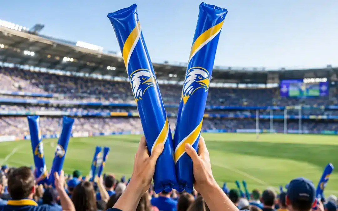
For crowd visibility, a simple logo or sponsor name placed along the main length of the stick is usually easier to recognise than a detailed design. When the sticks are held upright, vertically orientated artwork may make sense. When the audience is likely to clap the sticks horizontally, a horizontal layout can be more effective. There is no single correct direction – it depends on how the product will be used at your event.
Ask a practical question early: from ten or twenty metres away, what should a spectator be able to recognise? Usually, it is the club, event or campaign name first, followed by the principal sponsor. Fine print, long web addresses and small secondary logos rarely carry well at that distance.
Give the event identity first priority
Sponsors support the event because they want association and visibility, but the cheering stick still needs to feel like part of the occasion. A clear event, school or club identity gives the product purpose in supporters’ hands. It also makes sponsor recognition feel more natural rather than looking like a handout covered in unrelated advertising.
A useful approach is to reserve the most prominent print area for the host identity and allocate a strong, clearly defined section to the major sponsor. For example, one side can feature a fictional Bayside Falcons Club name and colours, while the reverse carries the presenting partner’s logo. This gives both identities room to be seen without forcing them to compete in the same space.
If a sponsor is funding the full item, a co-branded design may be appropriate. The sponsor logo can take a leading position while the event logo sits alongside it, provided the hierarchy has been agreed upfront. A quick conversation before artwork begins can prevent awkward revisions later, especially when several stakeholders have opinions about logo size.
Match logo size to sponsorship value
Not every sponsor needs equal treatment. A presenting partner, major donor or event naming partner normally warrants greater visual prominence than supporting businesses. That hierarchy should be reflected in the design, just as it would be on signage, uniforms or event programmes.
Where there are two or three partners, arranging logos in a neat sequence can work well. Keep similar logo heights rather than stretching smaller logos to fill a space. When there are many sponsors, however, printing every logo on a cheering stick can make the design crowded and reduce the value of each placement.
In that case, consider featuring one principal sponsor on the sticks and recognising the wider sponsor group through other approved event materials. Alternatively, use separate runs of cheering sticks for different sponsor groups, colours or crowd zones if the quantities and event plan make that practical.
Choose positions that work in motion
Cheering sticks move constantly. They twist, overlap, bend slightly and are often held by hands near the lower section. That makes some areas more useful than others.
The upper and central sections are generally the most visible when sticks are raised. Avoid placing a key logo too close to the opening, sealing area or bottom handle area, where the artwork may be less visible or partly covered. Keep important elements away from edges and allow comfortable clear space around them so the logo remains legible when the product is in use.
Printing on both sides can provide extra exposure, particularly at large events where the crowd faces different directions. One side may carry the event branding and the other a sponsor message. It can also be useful to repeat a simple sponsor logo on both sides if maximum recognition is the priority and the sponsor has a clean, high-contrast mark.
Custom inflatable shapes require their own approach. A logo on an inflatable cricket bat, rugby ball or event-specific shape should follow the most recognisable face of the product. Think about which side will face cameras and spectators, not simply which surface looks largest on an artwork template.
Keep artwork simple, bold and true to brand
Inflatable products reward clear design. Solid colours, bold lettering and uncomplicated logos are usually more effective than intricate illustrations or tiny text. A sponsor’s brand guidelines still matter, but some elements may need simplifying to suit the print area and viewing distance.
Contrast is particularly important. A dark logo on a dark stick, or a pale logo on a metallic finish, may lose impact depending on the artwork and lighting. Choose combinations that separate the logo from the product colour. If the sponsor has strict colour requirements, ask for approved logo files and colour references at the outset so the artwork can be prepared appropriately.
For best results, supply editable vector artwork where available. Formats such as AI, EPS or print-ready PDF generally give the artwork team more flexibility than a small image taken from a website or social post. If you only have a raster file, send the highest-resolution version you have and request guidance before production is approved.
Do not alter a sponsor’s logo by stretching it, changing its proportions or placing it over a busy graphic without permission. A logo can be made larger through better layout, stronger contrast and more clear space, rather than distortion.
Build a sponsor placement plan before requesting quotes
A short placement plan makes the quoting and proofing process faster. It does not need to be complicated. Confirm the product type, expected quantity, base colour, number of print sides, sponsor hierarchy and any important artwork requirements. Also decide whether logos are supplied by the sponsor, the event organiser or an agency.
It helps to record who has final approval for each logo. Clubs and schools often have a committee member, administrator or marketing contact responsible for sign-off, while sponsors may need their own brand manager to approve usage. Waiting until production is close to start before checking this can create avoidable delays.
If timing is tight, prioritise decisions that affect the product itself: product style, quantity, colours, print positions and final artwork. Optional additions such as foil effects, metallic finishes, LED products or custom shapes may change the production approach, so discuss these requirements early rather than assuming every option suits every deadline or order size.
Cheering Sticks can provide a digital proof before production, giving organisers a practical chance to check logo scale, orientation, spelling and the relationship between sponsor and event branding. Review the proof at normal screen size, then step back or zoom out. If the sponsor name cannot be read easily at a reduced size, the final crowd view may face the same issue.
A practical guide to sponsor logo placement approval
A good approval check is about more than confirming that every logo appears somewhere. Review whether the event identity is immediately clear, the principal sponsor receives the agreed prominence and secondary logos remain legible without cluttering the layout. Check colours, spelling, punctuation, sponsor legal lines and logo clear-space rules against the supplied brand assets.
It is also worth considering photography. A strong sponsor placement on cheering sticks can continue working after the event through club newsletters, event recaps, community media and social content. Designs with bold, simple branding are more likely to remain recognisable in a wide crowd photo than designs that rely on tiny detail.
Finally, make sure the distribution plan supports the sponsorship outcome. Hand the branded sticks out where the sponsor is visible, such as at entry points, supporter bays, activity zones or presentations. If the product is being used to lift atmosphere at a key moment, have it in the crowd before that moment arrives.
The most effective sponsor placement feels purposeful: supporters get a bright, fun item to wave and clap, while partners see their branding become part of the energy in the room or stadium. Start with a clear hierarchy, keep the artwork easy to read and send through your event details for practical advice before the design is locked in.