A cheering stick that looks great in a carton but disappears in a crowd is a missed opportunity. If you want real atmosphere, strong branding and something people actually wave, clap and keep, you need to know how to design cheering sticks with the event in mind – not just the logo.
The best designs do three jobs at once. They build noise, they lift visibility, and they make your team, sponsor or campaign impossible to miss from the stands, the sideline or the street. That means every choice matters, from colour and print coverage to shape, finish and the distance your design needs to work from.
How to design cheering sticks for real event impact
Start with the use case. A pair of inflatable cheering sticks for a school sports day needs a different approach from a metallic set for a finals match, an LED pair for a night activation, or a custom shape for a sponsor-driven promotion. Good design is not about squeezing every message onto the product. It is about making the product do its job fast.
Think about where people will see them. In a stadium, the design has to read from a distance and under movement. At a community event, people may be holding them at close range for photos and handing them to kids. At a branded campaign, your sticks may need to support both crowd energy and sponsor visibility. The right layout depends on that context.
This is where many buyers go wrong. They treat cheering sticks like a flyer. Too much detail, small text, multiple logos and low-contrast colours usually reduce impact. The stronger option is almost always simpler, bolder and more deliberate.
Start with one clear objective
Before artwork begins, decide what the sticks need to achieve. If the goal is team spirit, lead with club colours, mascot elements and short punchy wording. If the goal is sponsor exposure, the logo needs to be prominent and clean, with enough contrast to stay readable while the sticks are moving. If the goal is event atmosphere, visual energy matters just as much as branding.
One design can support more than one goal, but one goal should lead. That decision keeps the artwork focused and avoids the common problem of trying to please too many stakeholders at once.
Design for movement, not still images
A lot of artwork looks fine on screen and weak in action. Cheering sticks are constantly in motion. They twist, bounce, clap together and catch light differently depending on the finish. Fine detail gets lost. Thin fonts can disappear. Busy backgrounds can make your message unreadable.
Design as if people will only see the sticks for a second or two. Strong blocks of colour, bold logos, thick lettering and short wording perform better because they register instantly. If your message cannot be understood at a glance, simplify it.
Choose colours that work in a crowd
Colour does more than match your brand. It controls visibility. High-contrast combinations usually perform best, especially in large venues or busy outdoor settings. A dark logo on a light stick, or a bright print on a black or metallic base, tends to carry further than low-contrast artwork.
Club and school buyers often want exact team colours, which makes sense for identity. The trade-off is that some combinations are less readable than others. If your official colours are close in tone, you may need to enlarge the logo, reduce extra artwork or use more negative space so the design does not blur together.
Metallic and foil finishes can lift visual impact, particularly for night events, finals and promotional launches. They look energetic and premium, but they can also affect how print appears. That is why proofing matters. A silver or gold base can change the feel of certain colours, so it pays to check how the final design will present rather than assuming it will behave like a flat white surface.
Keep the message short
The best wording on cheering sticks is usually two to four words. Think team names, mascots, campaign slogans or direct support messages. Long taglines rarely work because the viewing time is short and the print area is narrow.
If you need to include a sponsor, event name and web address, prioritise what matters most. In many cases, one side can carry the primary branding while the other focuses on the team, event or callout. That approach often gives a cleaner result than forcing everything into one side.
Get the print layout right
When considering how to design cheering sticks, print placement is one of the biggest factors in how polished the final product looks. A centred logo can be the safest option, but it is not always the strongest. Repeated text, vertical layouts and edge-to-edge patterns can all work well if they suit the product and the audience.
What matters is balance. If the artwork sits too small, the stick can look empty. If it sits too large, the design may feel cramped or distort visually when inflated. Good layout leaves enough breathing room for the branding to stand out without looking lost.
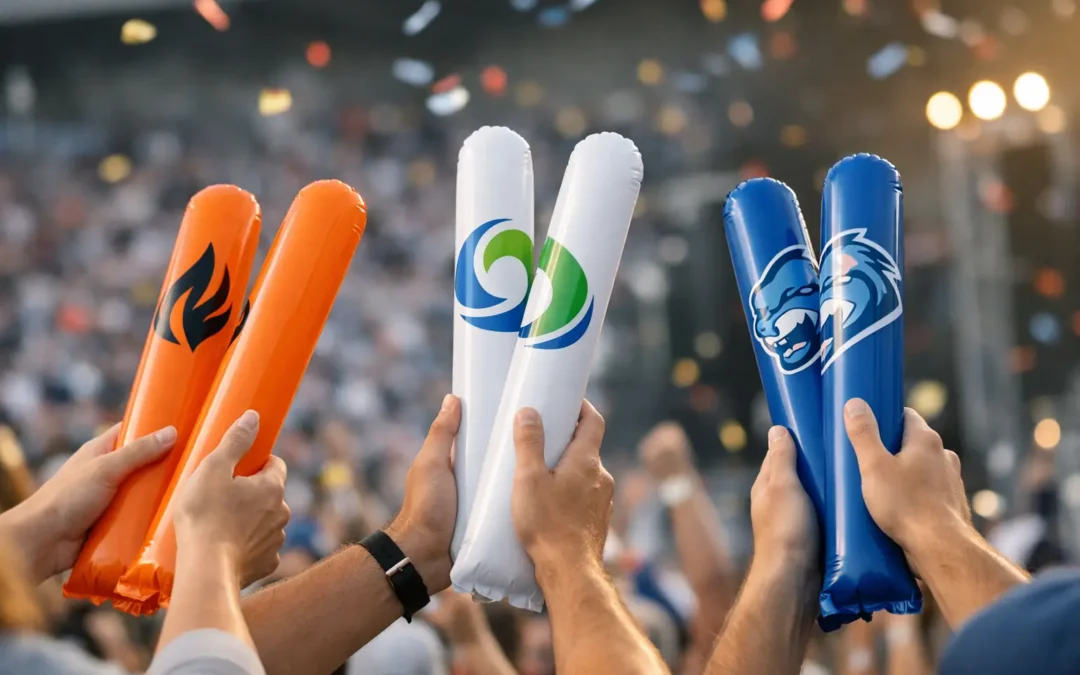
For many events, using both sticks as a pair is the smart move. One stick can carry a logo, while the other carries a slogan, mascot or sponsor mark. That creates more visual variety and can make the product feel more customised without complicating the message.
Think about finish and light
Standard printed inflatable sticks are a reliable option for most events because they are cost-effective and broadly versatile. If you need extra impact, metallic, foil or LED versions can shift the feel quickly. LED cheering sticks are especially effective for concerts, evening matches and indoor events where lighting becomes part of the crowd experience.
The trade-off is budget and timing. More specialised finishes or custom features can require tighter planning and clearer artwork decisions upfront. If your event date is close, a straightforward design on a proven format may be the safer call.
Custom shapes can do more than look different
Standard baton-style cheering sticks are popular because they are affordable, easy to distribute and effective. But for some campaigns, custom shapes add immediate recognition. Cricket bats, rugby balls, paws and other event-specific silhouettes can make the product feel tied directly to the occasion.
That said, custom shape does not automatically mean better result. If your main objective is low-cost volume for crowd noise, standard sticks may be the better choice. If you need a memorable branded giveaway, a custom shape can earn its keep by boosting photo appeal and event relevance. It depends on whether atmosphere, branding or novelty is leading the brief.
Match the design to the audience
School groups, sports clubs, corporate promoters and political campaign teams all buy cheering sticks, but they do not respond to the same design language. Junior events usually suit bright colours, clear text and playful graphics. Corporate activations often need cleaner branding and stronger consistency with existing campaign assets. Sports crowds tend to favour bold colour, big logos and messages that feel tribal and energetic.
This is where practical experience helps. The design should reflect not just your brand, but how the product will be used by the people holding it. A volunteer-run club ordering for a home game may need something simple, affordable and fast. A major event organiser may need stronger finish options and more detailed brand control.
Avoid the common design mistakes
The most frequent issue is overloading the artwork. Too much text, too many logos and unnecessary detail usually reduce impact. Another mistake is choosing colours that look good in a style guide but disappear in a live event setting.
Small logos are another problem. If brand exposure matters, make it obvious. People should not have to inspect the product to understand who it represents. And finally, do not ignore timing. Leaving design decisions too late can narrow your options on finishes, quantities and custom features.
Work from a proof, not a guess
A digital proof is where good ideas become real decisions. It lets you check scale, spacing, colour balance and overall readability before production. That matters even more with inflatable products, where proportion and placement can feel different once the item is printed and inflated.
If you are ordering for a club, school or campaign committee, a proof also helps everyone sign off on the same version. That prevents the last-minute confusion that often slows approvals.
For Australian event buyers, local service can make this whole process easier. Clear quoting, realistic turnaround guidance and fast artwork support remove a lot of risk, especially when event deadlines are fixed. Cheering Sticks works with buyers who need exactly that – practical advice, custom options and dependable delivery without the run-around.
The strongest cheering stick design is rarely the most complicated one. It is the one that looks sharp from a distance, feels right for the crowd, and does the job the second it gets waved in the air.